Showing posts with label color. Show all posts
2.17.2010
INSPIRED BY: Katy Rodriguez
These colors remind me of sea glass washed up on the shore -- makes for a lovely, muted color palette.
{Images: Katy Rodriguez Spring 2010 collection, Living Etc, House Beautiful, Domino, Rodarte Marbled Dress}
Labels:
color,
fashion,
Inspired By,
interior design
1.20.2010
Green All About It
I've decided that I like little pops of green in the kitchen. I know that the color green is
considered an appetite suppressant, but that isn't necessarily a bad thing in a kitchen!
I find the color soothing, and the more relaxed I am, the more likely I will cook.
The math adds up to green = good in my kitchen!


Though I'm definitely not feeling the all-over green look, so this kitchen's OUT,
but I do love that little window, a lot!

{Images 1. Jay Griffith, 2. Jonathan Adler, 3. Miles Redd all via House Beautiful}
considered an appetite suppressant, but that isn't necessarily a bad thing in a kitchen!
I find the color soothing, and the more relaxed I am, the more likely I will cook.
The math adds up to green = good in my kitchen!
Though I'm definitely not feeling the all-over green look, so this kitchen's OUT,
but I do love that little window, a lot!
{Images 1. Jay Griffith, 2. Jonathan Adler, 3. Miles Redd all via House Beautiful}
1.06.2010
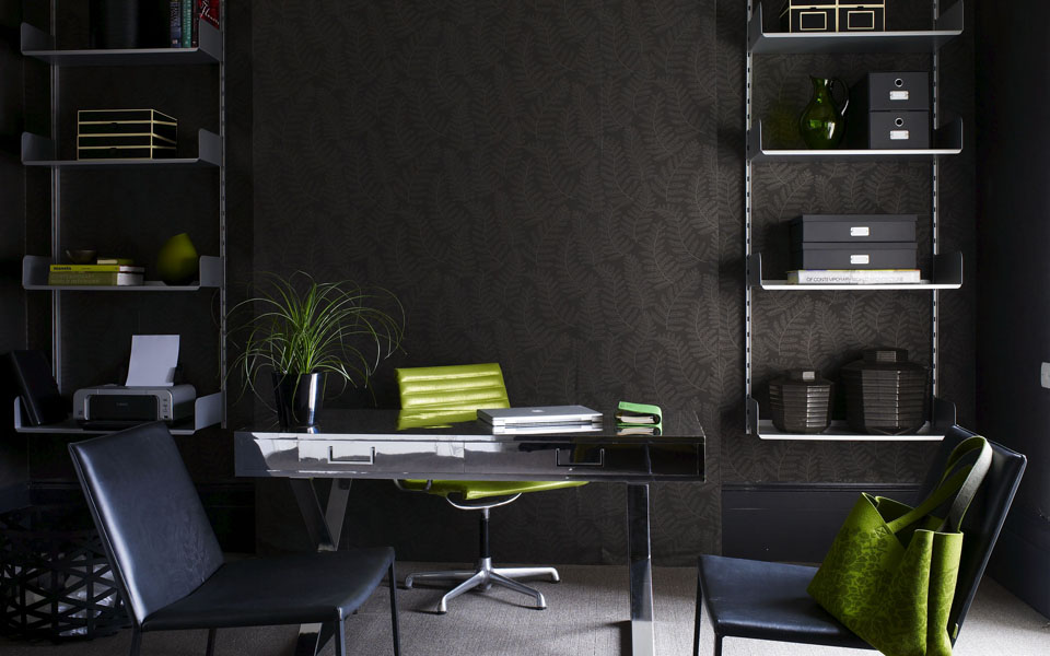
Grey + Green
It's been a while since I've done a 'Grey+_____' post, so here you have it. It's great how a bright green works with a dark palette or a light one, creating a dramatic eco-loving atmosphere either way!

Polly Wreford

Tim Evan-Cook

Adrian Briscoe
{images via Sarah Kaye Representation}
Polly Wreford
Tim Evan-Cook
Adrian Briscoe
{images via Sarah Kaye Representation}
Labels:
color,
decor,
interior design
9.02.2009
Orange {Crush might be too strong a word}
Yesterday Alek posted about orange walls, which I've yet to be convinced is the right choice for me. The color is definitely growing on me: I've moved from having an immediate visceral reaction to allowing the color to sink in before I judge it. In all honesty my orange aversion all started because growing up in Tennessee meant I was surrounded by by fanatic UT football fans who insisted on wearing, driving, and decorating everything in orange. My friends insisted their favorite color was orange to show their loyalty. Orange was no longer this warm, bright summer hue, but rather "UT Orange" that is harsh and blinding. Even writing about UT orange makes my lip curl... ugh, I just can't stand it. But thanks to Color Splash's David Bromstad, I've come to enjoy the combination of blue and orange!
I came across these photos this morning and I really love them, plus it reminded me of Alek's orange walls.


And believe me, it hasn't eluded me that I chose to create my blog with blue and orange... I'm a complicated person, what can I say?
{images by Cris Dobbins}
I came across these photos this morning and I really love them, plus it reminded me of Alek's orange walls.


And believe me, it hasn't eluded me that I chose to create my blog with blue and orange... I'm a complicated person, what can I say?{images by Cris Dobbins}
Labels:
color,
decor,
musings,
photography
Subscribe to:
Posts (Atom)